
لوحة النظرة العامة هي نقطة الدخول بعد تسجيل الدخول: تعرض ملخصاً للإيرادات والمصروفات والمهام المعلقة بحيث ترى صحة عملك دون التنقل بين كل وحدة.
من الشاشة الرئيسية يمكن الوصول السريع إلى إنشاء فاتورة أو عرض أسعار أو تسجيل مصروف، ما يقلل عدد النقرات للمسارات اليومية.
خصّص الترتيب أو البطاقات المعروضة حسب أولوياتك حتى يبقى الفريق متجهّزاً نحو نفس المؤشرات عند مراجعة الأعمال كل صباح.
عناصر اللوحة
فيما يلي لقطات من بطاقات ومخططات لوحة الرئيسية مع شرح موجز لكل منها.
بطاقات الملخص الرئيسية
أربع بطاقات تُجيب بسرعة عن: هل لدينا سيولة؟ هل العمليات مربحة؟ كم أنفقنا؟ وما مقدار مستحقات العملاء؟ تُعرض جنباً إلى جنب في صفّين (عمودان على الشاشات الأوسع) لمقارنة المؤشرات مرة واحدة.
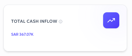
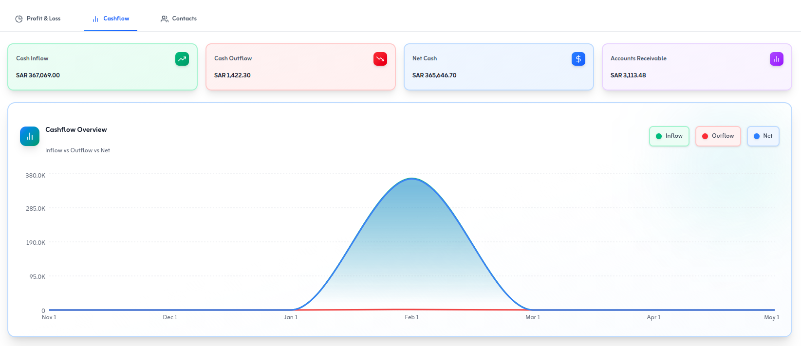
إجمالي التدفق النقدي
صافي حركة النقد للفترة يبيّن هل المنشأة تولّد نقداً أم تستهلكه. استخدمه كفحص أولي للسيولة قبل فتح الربط المصرفي أو مدفوعات الموردين أو تقارير التدفق التفصيلية.
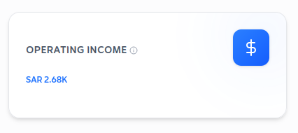
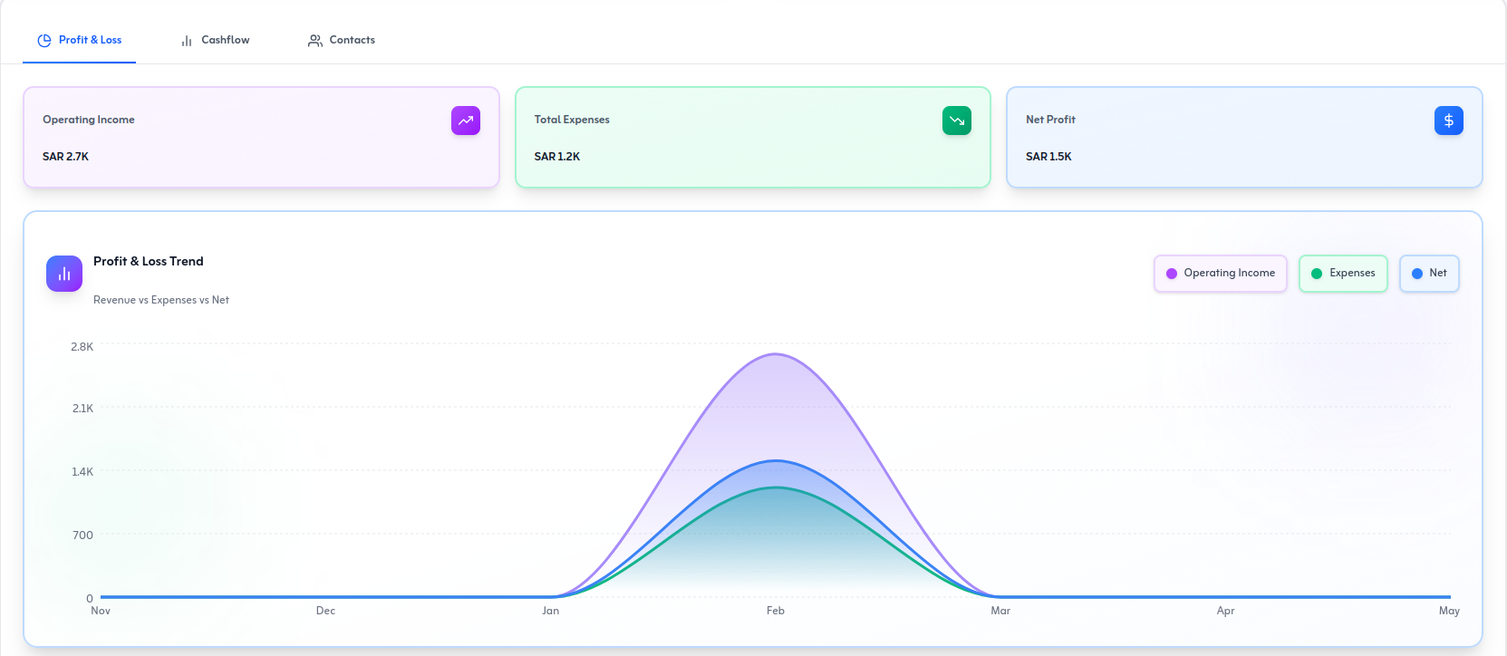
الدخل التشغيلي
يركّز هذا الرقم على الربح من العمليات الأساسية—المبيعات ناقص تكاليف التشغيل المتكررة لإدارة النشاط، قبل الفوائد والضريبة. دخل تشغيلي قوي يعني أن الأداء يقوده العمل اليومي لا تمويل أو بنود استثنائية.
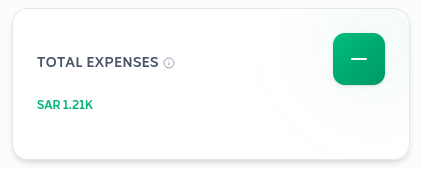
إجمالي المصروفات
يجمع إجمالي المصروفات ما قيّدته عبر الفئات للفترة المعروضة. قارنه بالشهر السابق أو بالميزانية لاكتشاف تجاوز الإنفاق مبكراً—قبل أن يظهر فقط عند إقفال الشهر.
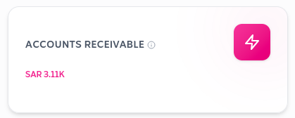
الذمم المدينة
تعرض الذمم المدينة فواتير العملاء غير المسددة. راقبها مع المبيعات: ذمم مدينة تنمو مع تحصيل نقدي ثابت قد تعني الحاجة لشروط دفع أو متابعات أوضح.
مخططات الاتجاه (بطاقات منحنى)
هذه البطاقات تتبع نفس أسلوب واجهة «صافي الربح»: أيقونة، عنوان، اختيار فترة (مثل ستة أشهر)، ومنحنى بمساحة مظللة. مرتبة في صفّين كي تقارن الدخل التشغيلي، هامش الربح، صافي الهامش، وإجمالي المصروفات معاً.
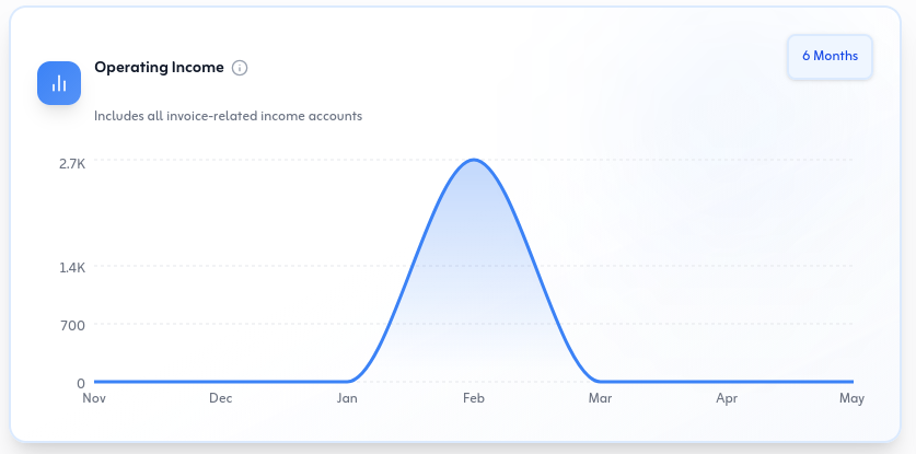
اتجاه الدخل التشغيلي
تعرض البطاقة كيف يتحرك الدخل التشغيلي عبر الأشهر التي تختارها (مثلاً ستة أشهر). استخدمها بجانب مخططات الهامش لترى هل الحجم أو التسعير أو التكلفة—لا مكاسب لمرة واحدة—هو ما يشكل النتائج.
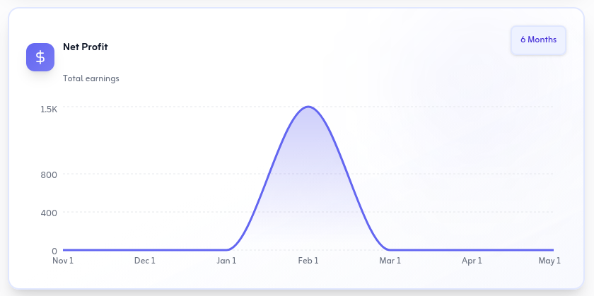
هامش صافي الربح
هامش صافي الربح بعد الضريبة وتكاليف التشغيل يبيّن ما يبقى من الإيرادات في كل فترة. اتساع المنحنى يعني غالباً تحسّن الكفاءة أو المزيج؛ ضيقه يستدعي مراجعة سريعة للضريبة والإنفاق المتكرر.
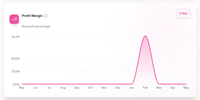
هامش الربح
هامش الربح الإجمالي أو التشغيلي مع الزمن يبرز قوة التسعير مقابل التكلفة المباشرة. قارنه ذهنياً مع بطاقة صافي الهامش: هامش إجمالي قوي مع صافي ضعيف غالباً يشير إلى أعباء تشغيل أو ضرائب.
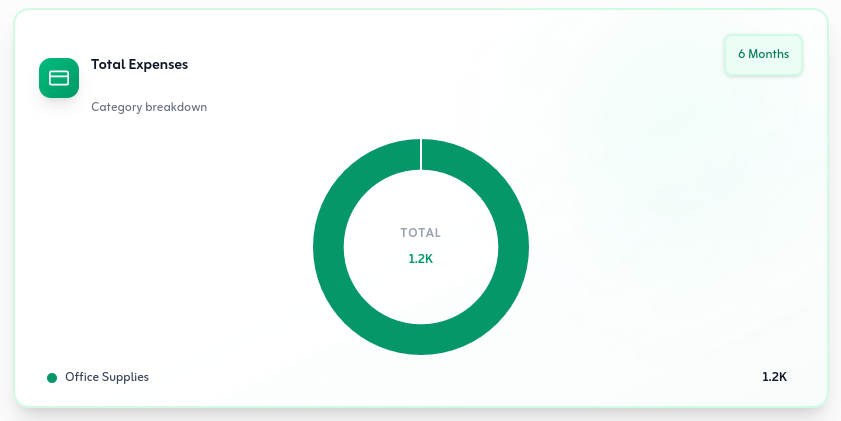
اتجاه إجمالي المصروفات
اتجاه المصروفات يعكس رقم الإجمالي على شكل منحنى—القمم تدل على دورات رواتب أو دفعات موردين أو موسمية. اجمعه مع بطاقات الدخل والهامش لتتأكد أن الإنفاق متوافق مع الإيرادات.
مخططات وملخصات إضافية
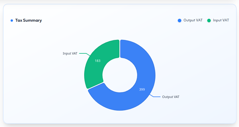
تدفق نقدي، أرباح وخسائر، وملخص ضريبي بعرض كامل للتفاصيل الأوسع.
اتجاه التدفق النقدي
يعرض المخطط كيف تتغيّر التدفقات الداخلة والخارجة مع الزمن—استخدمه لرصد الموسمية أو الانخفاص المتكررة قبل أن تؤثر على التشغيل.
اتجاه الأرباح والخسائر
راقب ما إذا كانت الإيرادات تتفوّق على التكاليف أسبوعاً بأسبوع أو شهراً بشهر—فحص سريع دون تشغيل تقرير أرباح وخسائر كامل.
ملخص الضريبة
لقطة ضريبية موجزة تدعم إقرارات ضريبة القيمة المختارة والتخطيط للاستحقاقات دون البحث في كل سطر فاتورة.
معاً، تعطيك هذه البطاقات والمخططات صورة متكاملة: السيولة والربحية والإنفاق والذمم المدينة في الأعلى، ثم الاتجاهات عبر الزمن، ثم التدفق النقدي والأرباح والضريبة للسياق الأوسع. راجع نفس الفترة عند مقارنة البطاقات حتى تبقى الأرقام متسقة.
عندما تحتاج تفاصيل أعمق—مثل قائمة فواتير غير مدفوعة أو تقرير ضريبي—افتح الوحدة المناسبة من القائمة الجانبية أو التقارير. اللوحة مخصّصة للمتابعة اليومية؛ التقارير الكاملة تبقى خطوة واحدة بعيداً.
نصائح سريعة
- ابدأ كل يوم بمراجعة الذمم المدينة والتدفق النقدي قبل إصدار فواتير أو مدفوعات جديدة.
- قارن مخططات الاتجاه مع بطاقات الملخص—إذا تعارضت، تحقق من الفترة الزمنية والمعاملات المسجّلة.
- للتعرّف على الشاشة الرئيسية قبل هذه التفاصيل، راجع مقالة نظرة عامة في القسم السابق.